Saturday, 16 June 2012

Skeleton Alphabet 3

Now for lowercase letters. We take the unit square (blue) and create a smaller construction motif (green) of size 'x' centred at the bottom:


Ann Camp suggests the x-height to be three-fifths, but if you choose 2/π (about 0.6366) things work out nicely later on (see below).


Ascenders go to the top of the unit square, thereby making them the same height as the capitals:


Similarly, descenders go below the baseline by the same amount:


In the 'g' above, the upper bowl is a circle of diameter one-half. The lower bowl is drawn by eye, according to Ann Camp.

Here are the trivial constructions:


The 'm' and 'w' letters are constructed like two 'n' and 'v' letters glued together. Because of our strange choice of x-height, they are exactly one unit wide:


The upper portion of the 'f' is like the arc of 'r':


The tail of 'j' is a quarter circle:


The crux of 'k' is determined in a similar manner as that of the capital 'K':


The 's' is drawn by eye:


The vertical of 't' is half the height of a standard ascender:


The tail of 'y' is drawn by eye:


All this leads to the following lowercase grid, with shadow glyphs from Arial (pink), Calibri (green) and Lucida (blue):


As with the capitals, there are a few changes I would personally make, by I'll leave that until next time.

Monday, 11 June 2012

Skeleton Alphabet 2

Last time, I traced Ann Camp's skeleton alphabet. I noticed that some of the capitals are much wider than those in modern typefaces, but this could be down to the fact that the skeleton alphabet is designed as the basis of pen lettering, not computer fonts.

Here's the skeleton alphabet superimposed on Arial (pink), Calibri (green) and Lucida (blue):


You can quickly see than Arial is quite a wide font ('K' and 'R' especially). Let's play around with some of the letters to investigate a few differences.

Many fonts have the lower leg of the capital 'K' attached to the upper arm, and not directly to the vertical. I've chosen the junction's vertical location according to the Golden Ratio, as I did with the crossbar of 'A':


The outer legs of 'M' are usually vertical for printing fonts:


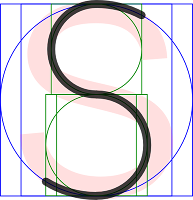
The upper and lower halves of the spine of 'S' usually join more smoothly than simply gluing two circular arcs together:


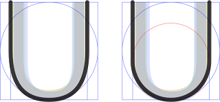
Similarly for the ugly corners in 'U':


The 'W' created by gluing two 'V' glyphs together is very wide, so squash it to fit the unit square (this may be a bit too much, depending on your taste):


Here's our final grid of skeleton capitals:


All curves are arcs of circles, except for the smoothing in 'S' and 'U'.

Personally, I think that the 'B', 'E', 'F', 'K', 'L', 'P', 'R', 'S' are a little too narrow and 'D' are 'H' are bit too wide for a "reading font," but you can certainly see the formal and/or "monumental" heritage of the letter forms.

If, like me, the fact that the curves in 'S' and 'U' are no longer all circular arcs rankles you, the following constructions can be substituted.


Above, the 'S' on the right-hand side consists of arcs from the red, green and blue circles with a short straight section in the middle. The diameter of the red circle is the width of the inner rectangle in the green construction motif.


Above, the 'U' on the right-hand side uses a semi-circle for its bowl (construction in red).

Friday, 8 June 2012

Skeleton Alphabet 1

I recently got my hands on an original copy of Ann Camp's "Pen Lettering" (1958) which describes the relative proportions of a skeleton alphabet.

The construction is as follows. Imagine a unit square:


Now inscribe a circle with unit diameter:


We construct a rectangle of unit height but width 'w' such that the area of the rectangle is the same as the area of the circle:


It follows that 'w' is 'π/4' or about 0.7854. This square-circle-rectangle outline is a fundamental construction motif:


Many capital letters can be traced from it:


In the tracing of the skeleton of 'C' above, the glyph has also been rendered using a well-known sans serif font in pink. Note that the skeleton letter (in black) has a slightly different aspect ratio. This is to be expected; the skeleton alphabet described here is the basis of a set of letters designed to be written using pens. It is based on straight lines and arcs of circles.


Interestingly, the 'M' described by Ann Camp has slightly sloping "verticals":


The 'Q' is just an 'O' with a tail, typically taking up a quarter of the height and half the width:


The raw skeletal 'U' has abrupt corners which are expected to be blended by eye for the final product.


The 'W' is simply two 'V's glued together:


If we utilise the centre of the construction motif, we can trace more letters:


For the letter 'A', halfway up is optically too high for the crossbar. I've chosen the golden ratio to determine 'a' to be about 0.3820:


If we stack two, half-height construction motifs within the unit square, we can trace 'P' and 'R':


However, the remaining letters require a slightly smaller upper section so as not to appear top-heavy. I've chosen 'b' such that the bottom-right corner of the upper square coincides with the top-right corner of the rectangle inside the lower square. That's approximately 0.5283.


Now we can construct most of the remaining capitals:


The final capital, 'S', requires that the two green motifs are stacked centrally. Parts of the blue circle and parts of the green circles are traced accordingly.


Here's the final grid of skeleton capitals:


Next time, I'll try rejigging the dimensions of the pen-based skeleton alphabet to better match modern font design.

Monday, 14 May 2012

Coat of Arms

Everyone should have one … even if unofficially.

Friday, 11 May 2012

School Reports

It may come as a surprise to anyone reading this blog of drivel, but Physical Education was not one of my strong subjects at school. Recently, on a visit back to my parents, they presented me with a brown envelope filled with all the school reports from my childhood. Needless to say, the P.E. comments were mildly entertaining.

Autumn 1980 C+ A good start but progress requires continuous effort.
Summer 1981 C Satisfactory work and progress made.
Autumn 1981 C+ Fair work and results.
Summer 1982 C Some steady work but Ian hasn't lost a lot of sweat this term.
Autumn 1982 C Satisfactory.
Summer 1983 C+ Satisfactory work and progress.
Winter 1984 C Ian has continued to work at a satisfactory level, although he does not possess any great natural ability, he tries hard.
Summer 1984 C- Slow progress maintained.
Spring 1985 C- A term of little progress but some enthusiasm.

Friday, 23 March 2012

RGB/HSV in HLSL 4

I've collated my implementations of RGB to HSV and HSL into a single webpage. See here.