To remove the nasty corner from the bowl of 'u' on the left, below, follow the red arc for the first half but the green arc for the second.
Similarly for 'n':
The 'm' is just two 'n' letters stuck together, with a small fillet in the middle:
We make the 'l' and 't' narrower:
Open the tail of 'g' and straighten the tail of 'y':
Smooth out the head of 'f' and shorten its crossbar:
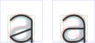
We also make the central bars of 'a' and 'e' horizontal:
Alas, the last two changes make the 'a' a little unbalanced and the 'e' a bit wide.
Never mind, we continue by making the 'k' such that the arm and leg are at right angles. Draw the leg first, then fit the arm:
Finally, the 's' needs fettling to only use circular arcs. This turns out to be very tricky. Here's one, less than satisfactory, construction:
That needs a bit more work put into it!
Thus far, the amended skeleton lowercase alphabet looks like this:
The whole set looks like this (badly kerned):


No comments:
Post a Comment