The underlying data for questions of life expectancy and mortality rates would seem to be a statistic named "Qx" (raw data). According to their guide, this is defined by the ONS as:
The mortality rate between age x and (x +1); that is, the probability that a person aged x exactly will die before reaching age (x +1).It is sometimes expressed as a probability multiplied by 100,000. You can plot this for males as a surface with one axis being the age, "x", and the other being the year of observation of "Qx":
The noise towards the "back" of the graph is due to the fact that concrete data beyond the age of 100 is very sparse, so probabilities are difficult to calculate accurately. The next derived value is "Lx" which the ONS defines as:
The number of survivors to exact age x of 100,000 live births of the same sex who are assumed to be subject throughout their lives to the mortality rates experienced in the 3-year period to which the national life table relates.I've approximated that as a normalised probability:
L[0] = 1
L[i] = L[i-1] * (1 - Q[i-1])
This gives a monotonically decreasing graph that reminds me a bit of a zero curve from fixed-income finance.
You can already see that the shape of the "Lx" curve has changed appreciably between 1850 and 2000. But the graphs (which I prepared using the excellent plotly) become easier to interpret if we add more colour levels:
You can start to see that there are strange "striations" in the surface. We now look at "Dx", defined as:
The number dying between exact age x and (x +1) described similarly to Lx.I used the following formula:
D[i] = L[i] - L[i+1]
This gives a surface that has a few interesting features clearly visible:
- The infant mortality rate (defined here as the number of deaths between 0 and 1 years, i.e. D[0]) has dropped from over 15% in 1850 to less than 0.5% after 2000.
- The adult life expectancy has improved; particularly after about 1950. This is indicated by the increase in height of the hump near the "front" of the surface, along with a gradual shift of the highest point towards greater ages. I suggest this is due to the introduction of the National Heath Service.
- There is a curious small green hump in the plateau near Year=1918, Age=20.
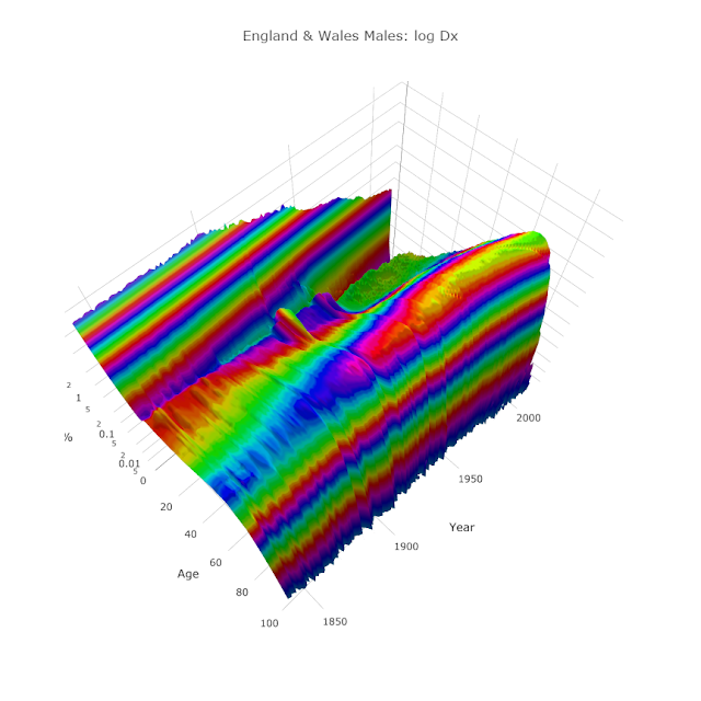
If, instead of graphing "Dx", we graph "log10(Dx)", we see even more features:
We can see that there is a second hump a couple of decades later that the original. Obviously these are due to the two World Wars (1914-1918 and 1939-1945 for Britain). However, the humps are present (though to a lesser extent) in the female graph too:
I was somewhat confused by this but it appears that some UK "life tables" (as actuaries optimistically call them) do not include deaths of service men and women on active duty. So perhaps the humps account for only civilian casualties: e.g. bombing victims and deaths due to general privations caused by the wars.
Another feature I found quite striking was the "male late-teen spike" that is seen better in this view:
There is a relatively sudden increase in male deaths in late-teens. This is well-known phenomenon that is nowhere near as pronounced in the female data:
In fact, after World War II, for females older than one year, log10(Dx) becomes amazingly linear until it peaks at 88 years old (for 2013 data).
One final feature, that I originally thought was a data or plotting bug, is the diagonal cleft you can just see in the green peak to the far right of the male (and female) Dx surfaces:
The diagonal cleft is aligned at exactly forty-five degrees:
Year=2000, Age=81 approx
Year=1950, Age=31 approx
Year=1940, Age=21 approx
Year=1930, Age=11 approx
Year=1920, Age=1 approx
My first theory is that the cleft is due to deaths in World War II. If a large percentage of young people are killed in the space of a few years, then this age range will be "under-represented" in the death statistics in subsequent years.
My second theory involves not the death rate, but the live birth rate. There was a noticeable dip in live births during World War I:
This dip wasn't seen during Second World II. Essentially, if there were fewer babies born in 1917-1919, there will be relatively fewer eight-one-year-olds in the year 2000.
So which theory is correct? I honestly don't know. Perhaps neither, Perhaps both. It may just be due to an accident of history that the drop in birth rate during World War I coincides with the tragic loss of men and women in their early twenties during World War II.
Interactive graphs here. Data courtesy of ONS.


