Monday, 25 June 2012
Thursday, 21 June 2012
QR Codes
I've been looking at QR codes recently. I'm intrigued at the idea of being able to customise them by deliberately obscuring sections, in the knowledge that the contents can be reconstructed via error correction. In experimentation, I've created two images that are successfully-decoded URLs:
The latter is more impressive, in my opinion, as it is only Version 2, with low data redundancy.
The latter is more impressive, in my opinion, as it is only Version 2, with low data redundancy.
Sunday, 17 June 2012
Skeleton Alphabet 4
Here are some alternative forms of the lowercase skeletons that only use straight lines and circular arcs.
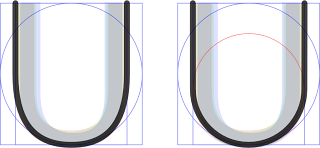
To remove the nasty corner from the bowl of 'u' on the left, below, follow the red arc for the first half but the green arc for the second.
Similarly for 'n':
The 'm' is just two 'n' letters stuck together, with a small fillet in the middle:
We make the 'l' and 't' narrower:
Open the tail of 'g' and straighten the tail of 'y':
Smooth out the head of 'f' and shorten its crossbar:
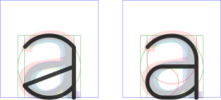
We also make the central bars of 'a' and 'e' horizontal:
Alas, the last two changes make the 'a' a little unbalanced and the 'e' a bit wide.
Never mind, we continue by making the 'k' such that the arm and leg are at right angles. Draw the leg first, then fit the arm:
Finally, the 's' needs fettling to only use circular arcs. This turns out to be very tricky. Here's one, less than satisfactory, construction:
That needs a bit more work put into it!
Thus far, the amended skeleton lowercase alphabet looks like this:
The whole set looks like this (badly kerned):
Saturday, 16 June 2012
Skeleton Alphabet 3
Now for lowercase letters. We take the unit square (blue) and create a smaller construction motif (green) of size 'x' centred at the bottom:
Ann Camp suggests the x-height to be three-fifths, but if you choose 2/π (about 0.6366) things work out nicely later on (see below).
Ascenders go to the top of the unit square, thereby making them the same height as the capitals:
Similarly, descenders go below the baseline by the same amount:
In the 'g' above, the upper bowl is a circle of diameter one-half. The lower bowl is drawn by eye, according to Ann Camp.
Here are the trivial constructions:
The 'm' and 'w' letters are constructed like two 'n' and 'v' letters glued together. Because of our strange choice of x-height, they are exactly one unit wide:
The upper portion of the 'f' is like the arc of 'r':
The tail of 'j' is a quarter circle:
The crux of 'k' is determined in a similar manner as that of the capital 'K':
The 's' is drawn by eye:
The vertical of 't' is half the height of a standard ascender:
The tail of 'y' is drawn by eye:
All this leads to the following lowercase grid, with shadow glyphs from Arial (pink), Calibri (green) and Lucida (blue):
As with the capitals, there are a few changes I would personally make, by I'll leave that until next time.
Monday, 11 June 2012
Skeleton Alphabet 2
Last time, I traced Ann Camp's skeleton alphabet. I noticed that some of the capitals are much wider than those in modern typefaces, but this could be down to the fact that the skeleton alphabet is designed as the basis of pen lettering, not computer fonts.
Here's the skeleton alphabet superimposed on Arial (pink), Calibri (green) and Lucida (blue):
You can quickly see than Arial is quite a wide font ('K' and 'R' especially). Let's play around with some of the letters to investigate a few differences.
Many fonts have the lower leg of the capital 'K' attached to the upper arm, and not directly to the vertical. I've chosen the junction's vertical location according to the Golden Ratio, as I did with the crossbar of 'A':
The outer legs of 'M' are usually vertical for printing fonts:
The upper and lower halves of the spine of 'S' usually join more smoothly than simply gluing two circular arcs together:
Similarly for the ugly corners in 'U':
The 'W' created by gluing two 'V' glyphs together is very wide, so squash it to fit the unit square (this may be a bit too much, depending on your taste):
Here's our final grid of skeleton capitals:
All curves are arcs of circles, except for the smoothing in 'S' and 'U'.
Personally, I think that the 'B', 'E', 'F', 'K', 'L', 'P', 'R', 'S' are a little too narrow and 'D' are 'H' are bit too wide for a "reading font," but you can certainly see the formal and/or "monumental" heritage of the letter forms.
If, like me, the fact that the curves in 'S' and 'U' are no longer all circular arcs rankles you, the following constructions can be substituted.
Above, the 'S' on the right-hand side consists of arcs from the red, green and blue circles with a short straight section in the middle. The diameter of the red circle is the width of the inner rectangle in the green construction motif.
Above, the 'U' on the right-hand side uses a semi-circle for its bowl (construction in red).
Here's the skeleton alphabet superimposed on Arial (pink), Calibri (green) and Lucida (blue):
You can quickly see than Arial is quite a wide font ('K' and 'R' especially). Let's play around with some of the letters to investigate a few differences.
Many fonts have the lower leg of the capital 'K' attached to the upper arm, and not directly to the vertical. I've chosen the junction's vertical location according to the Golden Ratio, as I did with the crossbar of 'A':
The outer legs of 'M' are usually vertical for printing fonts:
The 'W' created by gluing two 'V' glyphs together is very wide, so squash it to fit the unit square (this may be a bit too much, depending on your taste):
Here's our final grid of skeleton capitals:
All curves are arcs of circles, except for the smoothing in 'S' and 'U'.
Personally, I think that the 'B', 'E', 'F', 'K', 'L', 'P', 'R', 'S' are a little too narrow and 'D' are 'H' are bit too wide for a "reading font," but you can certainly see the formal and/or "monumental" heritage of the letter forms.
If, like me, the fact that the curves in 'S' and 'U' are no longer all circular arcs rankles you, the following constructions can be substituted.
Above, the 'S' on the right-hand side consists of arcs from the red, green and blue circles with a short straight section in the middle. The diameter of the red circle is the width of the inner rectangle in the green construction motif.
Subscribe to:
Comments (Atom)


