Here's the skeleton alphabet superimposed on Arial (pink), Calibri (green) and Lucida (blue):
You can quickly see than Arial is quite a wide font ('K' and 'R' especially). Let's play around with some of the letters to investigate a few differences.
Many fonts have the lower leg of the capital 'K' attached to the upper arm, and not directly to the vertical. I've chosen the junction's vertical location according to the Golden Ratio, as I did with the crossbar of 'A':
The outer legs of 'M' are usually vertical for printing fonts:
The 'W' created by gluing two 'V' glyphs together is very wide, so squash it to fit the unit square (this may be a bit too much, depending on your taste):
Here's our final grid of skeleton capitals:
All curves are arcs of circles, except for the smoothing in 'S' and 'U'.
Personally, I think that the 'B', 'E', 'F', 'K', 'L', 'P', 'R', 'S' are a little too narrow and 'D' are 'H' are bit too wide for a "reading font," but you can certainly see the formal and/or "monumental" heritage of the letter forms.
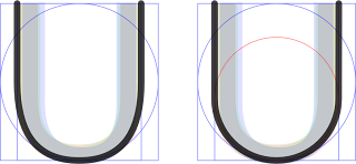
If, like me, the fact that the curves in 'S' and 'U' are no longer all circular arcs rankles you, the following constructions can be substituted.
Above, the 'S' on the right-hand side consists of arcs from the red, green and blue circles with a short straight section in the middle. The diameter of the red circle is the width of the inner rectangle in the green construction motif.


No comments:
Post a Comment