The construction is as follows. Imagine a unit square:
Now inscribe a circle with unit diameter:
We construct a rectangle of unit height but width 'w' such that the area of the rectangle is the same as the area of the circle:
It follows that 'w' is 'π/4' or about 0.7854. This square-circle-rectangle outline is a fundamental construction motif:
Many capital letters can be traced from it:
In the tracing of the skeleton of 'C' above, the glyph has also been rendered using a well-known sans serif font in pink. Note that the skeleton letter (in black) has a slightly different aspect ratio. This is to be expected; the skeleton alphabet described here is the basis of a set of letters designed to be written using pens. It is based on straight lines and arcs of circles.
Interestingly, the 'M' described by Ann Camp has slightly sloping "verticals":
The 'Q' is just an 'O' with a tail, typically taking up a quarter of the height and half the width:
The raw skeletal 'U' has abrupt corners which are expected to be blended by eye for the final product.
The 'W' is simply two 'V's glued together:
If we utilise the centre of the construction motif, we can trace more letters:
For the letter 'A', halfway up is optically too high for the crossbar. I've chosen the golden ratio to determine 'a' to be about 0.3820:
If we stack two, half-height construction motifs within the unit square, we can trace 'P' and 'R':
However, the remaining letters require a slightly smaller upper section so as not to appear top-heavy. I've chosen 'b' such that the bottom-right corner of the upper square coincides with the top-right corner of the rectangle inside the lower square. That's approximately 0.5283.
Now we can construct most of the remaining capitals:
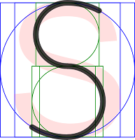
The final capital, 'S', requires that the two green motifs are stacked centrally. Parts of the blue circle and parts of the green circles are traced accordingly.
Here's the final grid of skeleton capitals:
Next time, I'll try rejigging the dimensions of the pen-based skeleton alphabet to better match modern font design.


Hi, the Black letters, what font is that?
ReplyDeleteThansk for all these posts on the construction of a nice typeface.
ReplyDeleteI've been looking for these 'true single fonts' for ages and, in the end, I have created a small web application that can generate text this way. It's located on https://www.templatemaker.nl/singlelinetext/
One of the 4 fonts that one can use, is based on these for blog entries. I called it 'AnnBam'
I made some adapaption on the 'B', 'e', 'a', 'l', and 'f' though :)